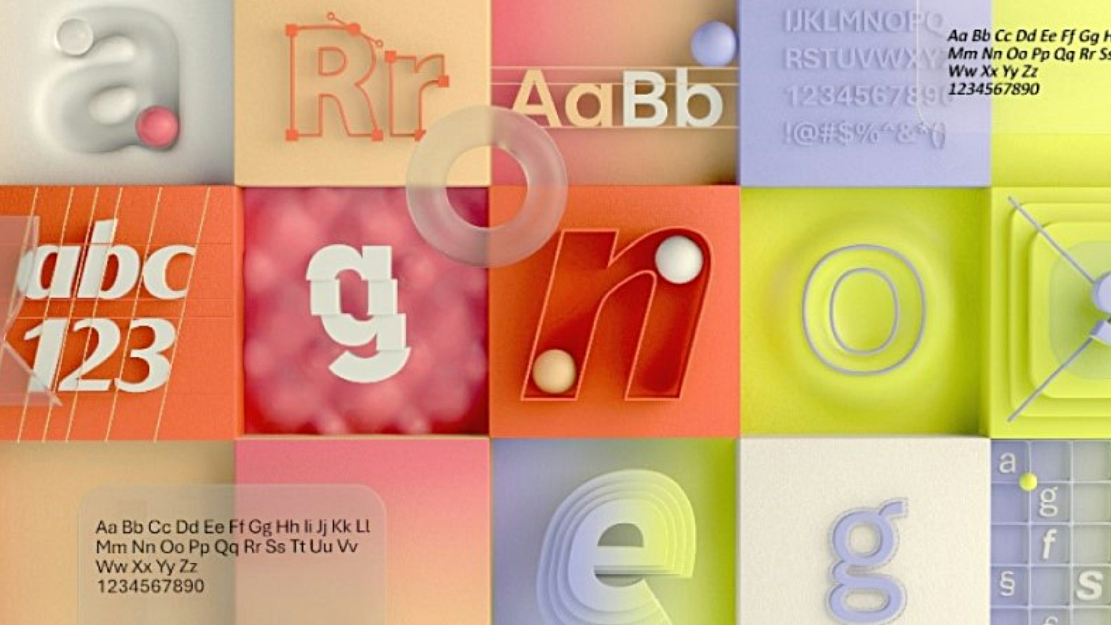
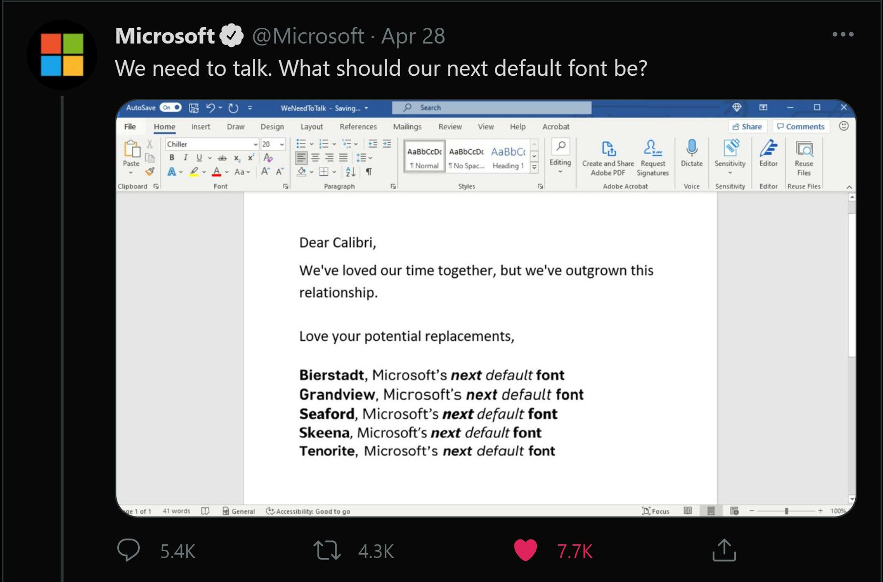
Calibri has been the default font for Microsoft users since 2007, replacing the 'legibility king' Times New Roman that first appeared in The Times of London newspaper in 1932. Even though the shift from Calibri may feel like an unnecessary redesign for some, the update feels representative of an improved, more modern Microsoft and with 2021 being a year of absolute change, it feels fitting for Microsoft to present us with an original, fresh new look after using the same default for over 14 years.
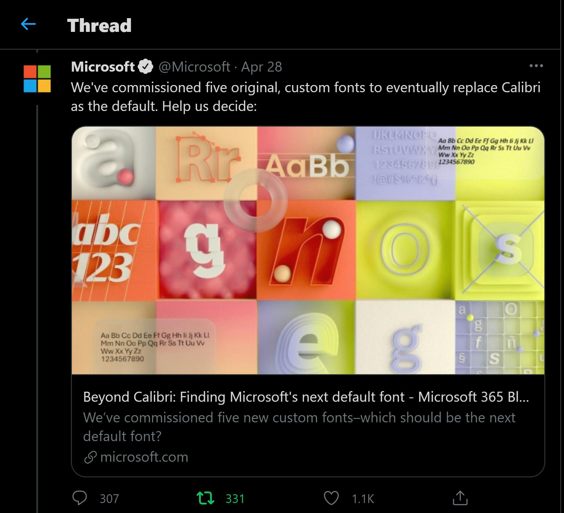
Just as Microsoft has kept Times New Roman as a font of choice, the same goes for Calibri so fans won't have to say their final goodbyes. According to the Microsoft Design Team, the new fonts will take the style of sans-serif, spanning—humanist, geometric, swiss-style, and industrial, and they have asked for the world's opinion across social platforms on which is preferred. So what are the new choices, and which one would you choose?
Related posts
Visit blog
How Much Does IT Support Cost for a Small Business? A Complete Guide
IT support encompasses a range of services designed to maintain and optimise technology infrastructure. For small businesses, this can include network management, hardware and software troubleshooting, cybersecurity, cloud services, data backup, and user assistance

ERP Implementation Cost Guide: Key Considerations, Strategies, and Planning Insights
This article explores the main factors that influence ERP implementation expenses, hidden considerations, and strategies for maximising return on investment.

What is ERP Implementation Life Cycle? A Complete Guide
However, implementing an ERP system is not a one-time activity; it is a structured process known as the ERP implementation life cycle